線形のグラデーションを表示する「linear-gradient関数」、線形のグラデーションを繰り返して表示する「repeating-linear-gradient関数」の使用方法を記載
対応バージョン:CSS3/2.1
対応ブラウザ
linear-gradient関数
| 使用できるプロパティ | 背景関連プロパティ |
| モジュール | image Values and Replaced Content Module Level 3 |
概要・使用方法
{ プロパティ:linear-gradient (方向,始点色 始点位置 , 終点色 終点位置);}
{ プロパティ:linear-gradient (方向,始点色 始点位置 , 途中色 途中位置 , 終点色 終点位置);}
CSS3では、要素の背景などで画像の代わりに色のグラデーションを指定することができます。グラデーションは、CSS3で規定されておりプロパティとしてではなく、プロパティの値(関数)として、backgroundプロパティなど画像を指定可能な箇所で画像の代わりに利用できます。
- linear-gradient()
- radial-gradient()
- repeating-linear-gradient()
- repeating-radial-gradient()
グラデーションの角度または方向(省略可)は、2つの方法で指定可能です。1つ目の方法は、グラデーションの軸となる線の角度を「45deg」などの単位付き数値で表します。負の値の指定も可能です。2つ目の方法は、グラデーションの方向を表すキーワード(to top、to right、to bottom、to left)のいずれかを使って表します。「to top」(上へ)はOdeg、「to right」(右へ)は90deg、「to bottom」(下へ)は180deg、「to left」(左へ)は270degの指定と同じです。グラデーションの角度または方向は省略でき、省略した場合には「to bottom」(下へ)が既定値となります。
角度または方向の指定後に、グラデーションの開始色、中間色(省略可)、終了色をそれぞれカンマ(,)で区切って続けます。中間色は省略でき、また複数指定することも可能です。開始色、中間色、終了色の色の指定については、その色の配置点を、グラデーションの開始地点を0%、終了地点を100%としたときのパーセント値、または長さのサイズ値を使って指定することができます。パーセント値(または長さのサイズ値)は、色の指定の後ろに半角スペースで区切って記述します。
※仕様上は、linear-gradientの値を、画像を指定可能なすべてのプロパティで指定できますが、現在のところ各ブラウザで指定できるのは、backgroundプロパティに限られています。
※グラデーションの方向を表すキーワードは、ブラウザによtっては新しい仕様に対応していないため、「to」を付けない形式(top、right、bottom、left)で指定する必要があります。その場合の方向は、toを付けた場合と逆向きになります。
引数の指定方法
グラデーションの方向を以下の数値、またはキーワードで指定します。
方向
| 数値 | degなどの単位付きの数値を指定します。0degで下から上へ向かうグラデーションとなり、正の値を指定することで時計回りに方向が決まります。 |
| to top | 領域内を上へ向かうグラデーションとなります。 |
| to top right | 領域内を右上角へ向かうグラデーションとなります。 |
| to right | 領域内を右へ向かうグラデーションとなります。 |
| to bottom right | 領域内を右下角へ向かうグラデーションとなります。 |
| to bottom | 領域内を下へ向かうグラデーションとなります。 |
| to bottom left | 領域内を左下角へ向かうグラデーションとなります。 |
| to left | 領域内を左へ向かうグラデーションとなります。 |
| to top left | 領域内を左上角へ向かうグラデーションとなります。 |
数値の指定方法

色
グラデーションの始点と終点の色を指定します。始点と終点はカンマ(,)で区切ります。
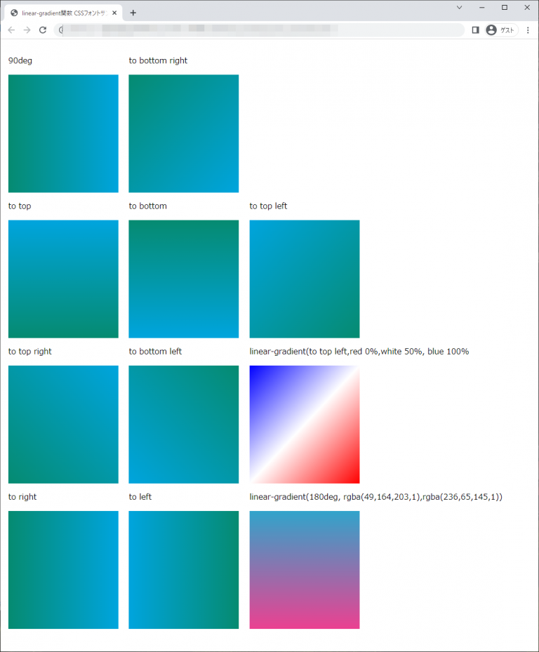
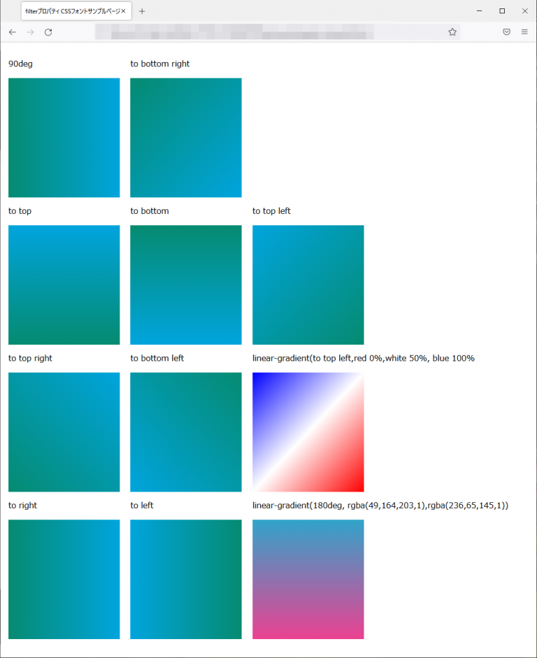
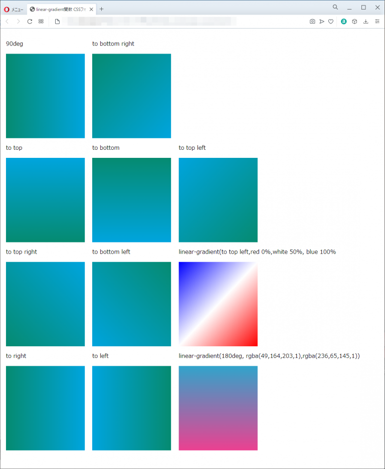
サンプルコード
<!DOCTYPE html>
<html lang="ja">
  <head>
    <title>linear-gradient関数 CSSフォントサンプルページ</title>
    <meta charset="uft-8">
    <style>
           .disp{display:inline-block;margin:0.5em;}
           .i90deg{
               height:15em;
               width:14em;
               background: linear-gradient(90deg,#068b71,#00a5de);
           }
           .totop{
               height:15em;
               width:14em;
               background: linear-gradient(to top,#068b71,#00a5de);
           }
           .totopright{
               height:15em;
               width:14em;
               background: linear-gradient(to top right,#068b71,#00a5de);
           }
            .toright{
               height:15em;
               width:14em;
               background: linear-gradient(to right,#068b71,#00a5de);
           }

            .tobottomright{
               height:15em;
               width:14em;
               background: linear-gradient(to bottom right,#068b71,#00a5de);
           }

           .tobottom{
               height:15em;
               width:14em;
               background: linear-gradient(to bottom,#068b71,#00a5de);
           }

           .tobottomleft{
               height:15em;
               width:14em;
               background: linear-gradient(to bottom left,#068b71,#00a5de);
           }

           .toleft{
               height:15em;
               width:14em;
               background: linear-gradient(to left,#068b71,#00a5de);
           }

           .totopleft{
               height:15em;
               width:14em;
               background: linear-gradient(to top left,#068b71,#00a5de);
           }

           .type1{
               height:15em;
               width:14em;
               background-image: linear-gradient(to top left,red 0%,white 50%, blue 100%);
           }

           .type2{
               height:15em;
               width:14em;
               background-image: linear-gradient(180deg, rgba(49,164,203,1),rgba(236,65,145,1));
           }
    </style>
  </head>
  <body>
      <div class="disp">
          <p>90deg</p>
          <div class="i90deg"></div>

          <p>to top</p>
          <div class="totop"></div>

          <p>to top right</p>
          <div class="totopright"></div>

          <p>to right</p>
          <div class="toright"></div>
      </div>

      <div class="disp">
          <p>to bottom right</p>
          <div class="tobottomright"></div>

          <p>to bottom</p>
          <div class="tobottom"></div>

          <p>to bottom left</p>
          <div class="tobottomleft"></div>

          <p>to left</p>
          <div class="toleft"></div>
      </div>

      <div class="disp">
          <p>to top left</p>
          <div class="totopleft"></div>

          <p>linear-gradient(to top left,red 0%,white 50%, blue 100%</p>
          <div class="type1"></div>

          <p>linear-gradient(180deg, rgba(49,164,203,1),rgba(236,65,145,1))</p>
          <div class="type2"></div>
      </div>

  </body>
</html>
90deg
to top
to top right
to right
to bottom right
to bottom
to bottom left
to left
to top left
linear-gradient(to top left,red 0%,white 50%, blue 100%
linear-gradient(180deg, rgba(49,164,203,1),rgba(236,65,145,1))
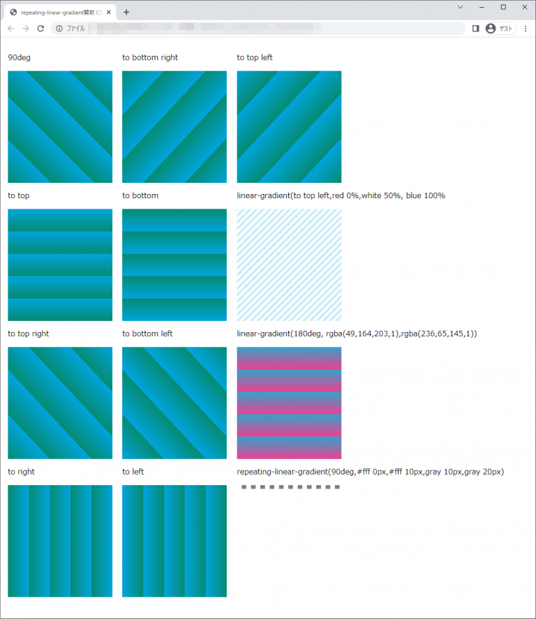
chromeブラウザ実行結果
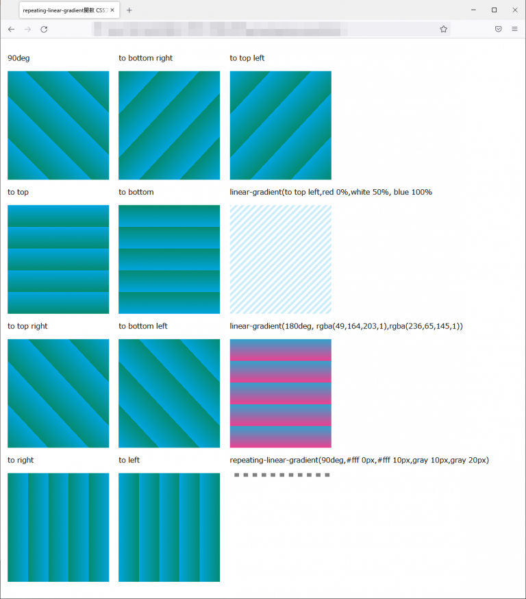
Firefox ブラウザ実行結果
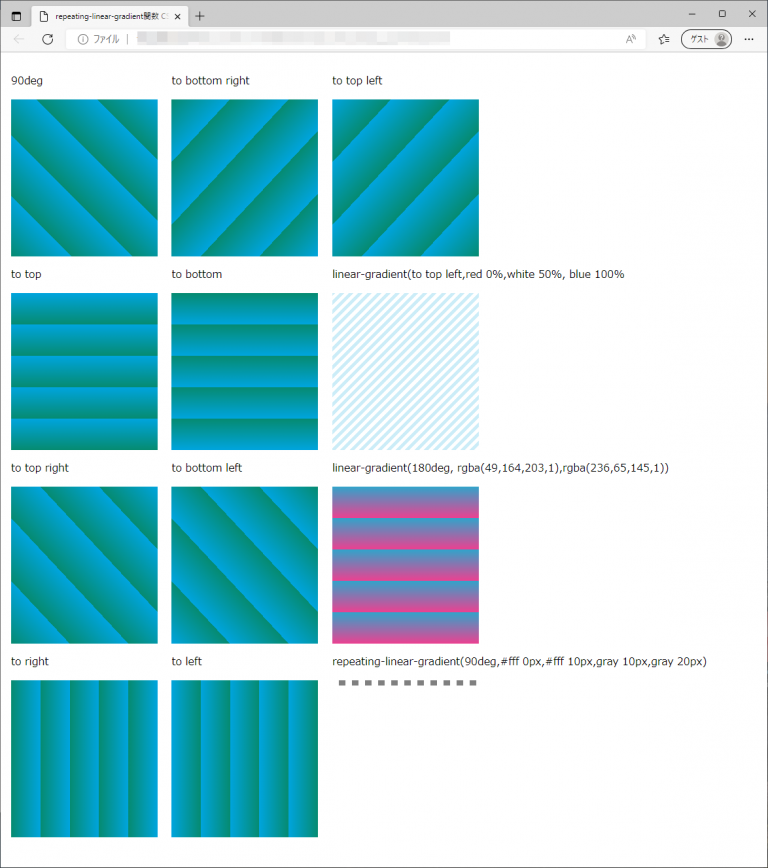
edgeブラウザ実行結果

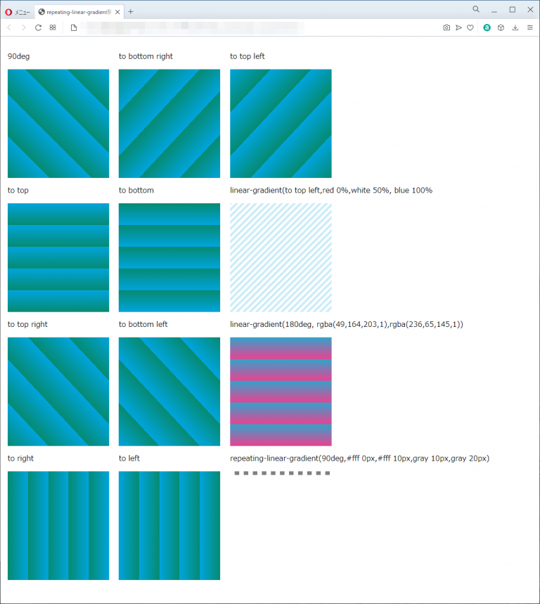
operaブラウザ実行結果
repeating-linear-gradient関数
| 使用できるプロパティ | 背景関連プロパティ |
| モジュール | image Values and Replaced Content Module Level 3 |
概要・使用方法
{ プロパティ:repeating-linear-gradient (方向,始点色 始点位置 , 終点色 終点位置);}
{ プロパティ:repeating-linear-gradient (方向,始点色 始点位置 , 途中色 途中位置 , 終点色 終点位置);}repeating-linear-gradient関数は、backgroundプロパティなどの背景関連プロパティの値に指定でき、繰り返される線形のグラデーションを表します。
引数の指定方法
linear-gradient関数と同様。
サンプルコード
<!DOCTYPE html>
<html lang="ja">
  <head>
    <title>repeating-linear-gradient関数 CSSフォントサンプルページ</title>
    <meta charset="uft-8">
    <style>
           .disp{display:inline-block;margin:0.5em;}
           .repeating-i90deg{
               height:15em;
               width:14em;
               background: repeating-linear-gradient(45deg , #068b71 40%,#00a5de 60%);
           }
           .repeating-totop{
               height:15em;
               width:14em;
               background: repeating-linear-gradient(to top, #068b71 40%,#00a5de 60%);
           }
           .repeating-totopright{
               height:15em;
               width:14em;
               background: repeating-linear-gradient(to top right, #068b71 40%,#00a5de 60%);
           }
            .repeating-toright{
               height:15em;
               width:14em;
               background: repeating-linear-gradient(to right, #068b71 40%,#00a5de 60%);
           }

            .repeating-tobottomright{
               height:15em;
               width:14em;
               background: repeating-linear-gradient(to bottom right, #068b71 40%,#00a5de 60%);
           }

           .repeating-tobottom{
               height:15em;
               width:14em;
               background: repeating-linear-gradient(to bottom, #068b71 40%,#00a5de 60%);
           }

           .repeating-tobottomleft{
               height:15em;
               width:14em;
               background: repeating-linear-gradient(to bottom left, #068b71 40%,#00a5de 60%);
           }

           .repeating-toleft{
               height:15em;
               width:14em;
               background: repeating-linear-gradient(to left, #068b71 40%,#00a5de 60%);
           }

           .repeating-totopleft{
               height:15em;
               width:14em;
               background: repeating-linear-gradient(to top left, #068b71 40%,#00a5de 60%);
           }

           .repeating-type1{
               height:15em;
               width:14em;
               background-image: repeating-linear-gradient(-45deg,#fff,#fff 5px,#ccedf8 5px,#ccedf8 10px);
           }

           .repeating-type2{
               height:15em;
               width:14em;
               background-image: repeating-linear-gradient(180deg, rgba(49,164,203,1) 40%,rgba(236,65,145,1) 60%);
           }

           .repeating-type3{
               height:0.5em;
               width:14em;
               background-image: repeating-linear-gradient(90deg,#fff 0px,#fff 10px,gray 10px,gray 20px);
           }
    </style>
  </head>
  <body>
      <div class="disp">
          <p>90deg</p>
          <div class="repeating-i90deg"></div>

          <p>to top</p>
          <div class="repeating-totop"></div>

          <p>to top right</p>
          <div class="repeating-totopright"></div>

          <p>to right</p>
          <div class="repeating-toright"></div>
      </div>

      <div class="disp">
          <p>to bottom right</p>
          <div class="repeating-tobottomright"></div>

          <p>to bottom</p>
          <div class="repeating-tobottom"></div>

          <p>to bottom left</p>
          <div class="repeating-tobottomleft"></div>

          <p>to left</p>
          <div class="repeating-toleft"></div>
      </div>

      <div class="disp">
          <p>to top left</p>
          <div class="repeating-totopleft"></div>

          <p>linear-gradient(to top left,red 0%,white 50%, blue 100%</p>
          <div class="repeating-type1"></div>

          <p>linear-gradient(180deg, rgba(49,164,203,1),rgba(236,65,145,1))</p>
          <div class="repeating-type2"></div>

          <p>repeating-linear-gradient(90deg,#fff 0px,#fff 10px,gray 10px,gray 20px)</p>
          <div class="repeating-type3"></div>
      </div>
  </body>
</html>
90deg
to top
to top right
to right
to bottom right
to bottom
to bottom left
to left
to top left
linear-gradient(to top left,red 0%,white 50%, blue 100%
linear-gradient(180deg, rgba(49,164,203,1),rgba(236,65,145,1))
repeating-linear-gradient(90deg,#fff 0px,#fff 10px,gray 10px,gray 20px)
chromeブラウザ実行結果
Firefox ブラウザ実行結果
edgeブラウザ実行結果
operaブラウザ実行結果

コメント