ぼかしや色変化などのグラフィック効果を指定する「filterプロパティ」、要素の背後の領域にぼかしや色変化のようなグラフィック効果を指定する「backdrop-filterプロパティ」の使用方法を記載
対応バージョン:CSS3/2.1
対応ブラウザ
filterプロパティ
| 初期値 | none |
| 適用される要素 | すべての要素。SVGではdefs要素とすべてのグラフィック要素、use要素を除くコンテナー要素 |
| モジュール | Filter Effects Module Level 1 |
| 継承 | なし |
概要・使用方法
{ filter: 効果;}「filterプロパティ」は、要素に適用するぼかしや色変化などのグラフィック効果を指定します。noneを除き関数型の値となり、半角スペースで区切って複数の効果を指定できます。また、SVGフィルターのURLも指定可能です。
またフィルターは画像、背景、境界の描画調整でよく使用されます。
指定できる表示サイズ
| none | 要素にフィルターを適用しません。 | |
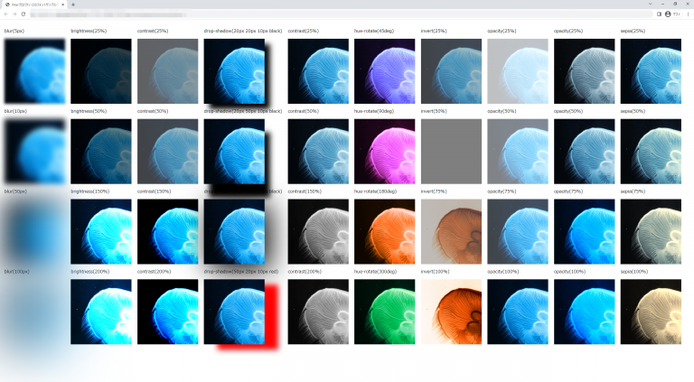
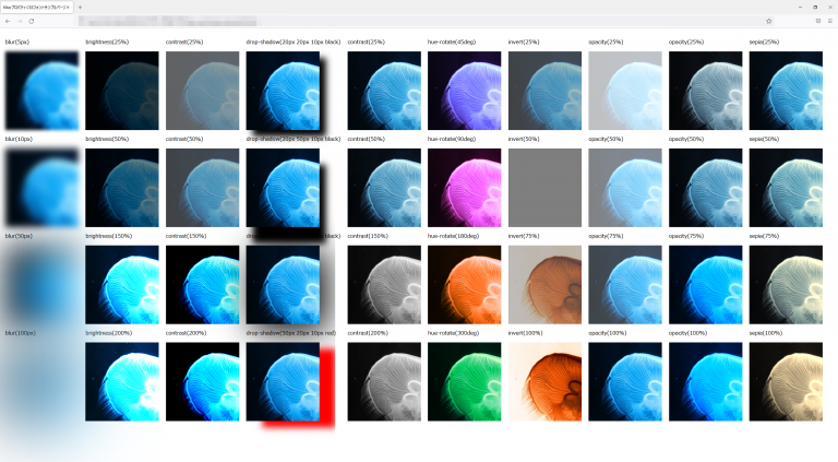
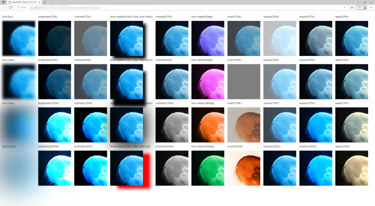
| blur() | ぼかし | 要素をぼかします。blur(10px)と指定すると半径10pxで「すりガラス」のようなぼかし効果になります。 ※パーセントは使用できません。 |
| brightness() | 明度 | 要素の明るさを指定します。brightness(.5)で明るさ50%や100%を超える 値を指定した場合は、さらに明るい効果が得られます。 |
| contrast() | コントラスト | 要素のコントラストを指定します。contrast(.5)でコントラスト50%や100%を超える値を指定した場合は、 さらにコントラストが強い効果が得られます。 |
| drop-shadow() | ドロップシャドウ | 要素にドロップシャドウを適用します。drop-shadow()関数と同様です。 |
| grayscale() | グレースケール | 要素をグレースケールに変換します。grayscale(100%)で完全なグレースケールに、grayscale(50%)、grayscale(.5)で 半分のグレースケールになります。 |
| hue-rotate() | 色相 | 要素の色相を全体的に変更します。hue-rotate(90deg)のように色相の変化を角度で指定します。※360degを指定すると元に戻ります |
| invert() | 階調の反転 | 要素の色を反転させます。invert(.5)あるはinvert(70%)のように色相の反転数値、または%値で指定します。 また、0%では入力画像が変化しないままになります。 |
| opacity() | 不透明度 | 要素を半透明にします。opacity(50%)で半分の透過率になります。0%を指定することで完全に透明になります。 opacityと似ていますが、一部のブラウザーでは性能を向上させるためハードウェアアクセラレーションを使用している点が異なります。 |
| saturate() | 彩度 | 要素の彩度を指定します。引数に100%未満の指定をすると彩度を下げます。100%を超えるような指定をすると彩度を上げます。 |
| sepia() | セピア | 要素をセピア調に変換します。sepia(.5)及びsepia(100%)のように指定します。100%を指定すると完全なセピア調になります。 |
| url() | SVGフィルターへのURLを指定します。 |
サンプルコード
url()関数にSVGフィルターを使用した例
<!DOCTYPE html>
<html lang="ja">
  <head>
    <title>filterプロパティ CSSフォントサンプルページ</title>
    <meta charset="uft-8">
    <style>
           img.sample1{filter: url(#blur)}
    </style>
  </head>
  <body>
      <img class="sample1" src="https://kcfran.com/sample/359600_s.jpg" alt="filterサンプル画像">
      <svg height="0" width="0">
          <defs>
              <filter id="blur" x="0" y="0">
                  <feGaussianBlur in="SourceGraphic" stdDeviation="15">
              </filter>
          </defs>
      </svg>
  </body>
</html>
サンプルコード2
<!DOCTYPE html>
<html lang="ja">
  <head>
    <title>filterプロパティ CSSフォントサンプルページ</title>
    <meta charset="uft-8">
    <style>
           .disp{display:inline-block;margin:0.5em;}

          .base{
               background-size: auto;
               height:10em;
               width:10em;
               background-image: url("https://kcfran.com/sample/359600_s.jpg");
               filter:none;
           }
           .blur5{
               background-size: auto;
               height:15em;
               width:14em;
               background-image: url("https://kcfran.com/sample/359600_s.jpg");
               filter: blur(5px);
           }
           .blur10{
               background-size: auto;
               height:15em;
                width:14em;
               background-image: url("https://kcfran.com/sample/359600_s.jpg");
               filter: blur(10px);
           }
           .blur50{
               background-size: auto;
               height:15em;
                width:14em;
               background-image: url("https://kcfran.com/sample/359600_s.jpg");
               filter: blur(50px);
           }
           .blur100{
               background-size: auto;
               height:15em;
                width:14em;
               background-image: url("https://kcfran.com/sample/359600_s.jpg");
               filter: blur(100px);
           }

          .brightness25{
               background-size: auto;
               height:15em;
                width:14em;
               background-image: url("https://kcfran.com/sample/359600_s.jpg");
               filter: brightness(25%);
           }
           .brightness50{
               background-size: auto;
               height:15em;
               width:14em;
               background-image: url("https://kcfran.com/sample/359600_s.jpg");
               filter: brightness(50%);
           }
           .brightness150{
               background-size: auto;
               height:15em;
               width:14em;
               background-image: url("https://kcfran.com/sample/359600_s.jpg");
               filter: brightness(150%);
           }
           .brightness200{
               background-size: auto;
               height:15em;
               width:14em;
               background-image: url("https://kcfran.com/sample/359600_s.jpg");
               filter: brightness(200%);
           }

           .contrast25{
               background-size: auto;
               height:15em;
               width:14em;
               background-image: url("https://kcfran.com/sample/359600_s.jpg");
               filter: contrast(25%);
           }
           .contrast50{
               background-size: auto;
               height:15em;
               width:14em;
               background-image: url("https://kcfran.com/sample/359600_s.jpg");
               filter: contrast(50%);
           }
           .contrast150{
               background-size: auto;
               height:15em;
               width:14em;
               background-image: url("https://kcfran.com/sample/359600_s.jpg");
               filter: contrast(150%);
           }
           .contrast200{
               background-size: auto;
               height:15em;
               width:14em;
               background-image: url("https://kcfran.com/sample/359600_s.jpg");
               filter: contrast(200%);
           }

           .drop-shadow1{
               background-size: auto;
               height:15em;
               width:14em;
               background-image: url("https://kcfran.com/sample/359600_s.jpg");
               filter: drop-shadow(20px 20px 10px black);
           }
           .drop-shadow2{
               background-size: auto;
               height:15em;
               width:14em;
               background-image: url("https://kcfran.com/sample/359600_s.jpg");
               filter: drop-shadow(20px 50px 10px black);
           }
           .drop-shadow3{
               background-size: auto;
               height:15em;
               width:14em;
               background-image: url("https://kcfran.com/sample/359600_s.jpg");
               filter: drop-shadow(20px 20px 50px black);
           }
           .drop-shadow4{
               background-size: auto;
               height:15em;
               width:14em;
               background-image: url("https://kcfran.com/sample/359600_s.jpg");
               filter: drop-shadow(50px 20px 10px red);
           }

           .grayscale25{
               background-size: auto;
               height:15em;
               width:14em;
               background-image: url("https://kcfran.com/sample/359600_s.jpg");
               filter: grayscale(25%);
           }
           .grayscale50{
               background-size: auto;
               height:15em;
               width:14em;
               background-image: url("https://kcfran.com/sample/359600_s.jpg");
               filter: grayscale(50%);
           }
           .grayscale150{
               background-size: auto;
               height:15em;
               width:14em;
               background-image: url("https://kcfran.com/sample/359600_s.jpg");
               filter: grayscale(150%);
           }
           .grayscale200{
               background-size: auto;
               height:15em;
               width:14em;
               background-image: url("https://kcfran.com/sample/359600_s.jpg");
               filter: grayscale(200%);
           }

           .hue-rotate45{
               background-size: auto;
               height:15em;
               width:14em;
               background-image: url("https://kcfran.com/sample/359600_s.jpg");
               filter: hue-rotate(45deg);
           }
           .hue-rotate90{
               background-size: auto;
               height:15em;
               width:14em;
               background-image: url("https://kcfran.com/sample/359600_s.jpg");
               filter: hue-rotate(90deg);
           }
           .hue-rotate180{
               background-size: auto;
               height:15em;
               width:14em;
               background-image: url("https://kcfran.com/sample/359600_s.jpg");
               filter: hue-rotate(180deg);
           }
           .hue-rotate300{
               background-size: auto;
               height:15em;
               width:14em;
               background-image: url("https://kcfran.com/sample/359600_s.jpg");
               filter: hue-rotate(300deg);
           }

           .invert25{
               background-size: auto;
               height:15em;
               width:14em;
               background-image: url("https://kcfran.com/sample/359600_s.jpg");
               filter: invert(25%);
           }
           .invert50{
               background-size: auto;
                height:15em;
               width:14em;
               background-image: url("https://kcfran.com/sample/359600_s.jpg");
               filter: invert(50%);
           }
           .invert75{
               background-size: auto;
                height:15em;
               width:14em;
               background-image: url("https://kcfran.com/sample/359600_s.jpg");
               filter: invert(75%);
           }
           .invert100{
               background-size: auto;
               height:15em;
               width:14em;
               background-image: url("https://kcfran.com/sample/359600_s.jpg");
               filter: invert(100%);
           }

           .opacity25{
               background-size: auto;
               height:15em;
               width:14em;
               background-image: url("https://kcfran.com/sample/359600_s.jpg");
               filter: opacity(25%);
           }
           .opacity50{
               background-size: auto;
               height:15em;
               width:14em;
               background-image: url("https://kcfran.com/sample/359600_s.jpg");
               filter: opacity(50%);
           }
           .opacity75{
               background-size: auto;
               height:15em;
               width:14em;
               background-image: url("https://kcfran.com/sample/359600_s.jpg");
               filter: opacity(75%);
           }
           .opacity100{
               background-size: auto;
               height:15em;
               width:14em;
               background-image: url("https://kcfran.com/sample/359600_s.jpg");
               filter: opacity(100%);
           }

           .saturate25{
               background-size: auto;
               height:15em;
               width:14em;
               background-image: url("https://kcfran.com/sample/359600_s.jpg");
               filter: saturate(25%);
           }
           .saturate50{
               background-size: auto;
                height:15em;
               width:14em;
               background-image: url("https://kcfran.com/sample/359600_s.jpg");
               filter: saturate(50%);
           }
           .saturate150{
               background-size: auto;
                height:15em;
               width:14em;
               background-image: url("https://kcfran.com/sample/359600_s.jpg");
               filter: saturate(150%);
           }
           .saturate200{
               background-size: auto;
               height:15em;
               width:14em;
               background-image: url("https://kcfran.com/sample/359600_s.jpg");
               filter: saturate(200%);
           }

           .sepia25{
               background-size: auto;
               height:15em;
               width:14em;
               background-image: url("https://kcfran.com/sample/359600_s.jpg");
               filter: sepia(25%);
           }
           .sepia50{
               background-size: auto;
                height:15em;
               width:14em;
               background-image: url("https://kcfran.com/sample/359600_s.jpg");
               filter: sepia(50%);
           }
           .sepia75{
               background-size: auto;
                height:15em;
               width:14em;
               background-image: url("https://kcfran.com/sample/359600_s.jpg");
               filter: sepia(75%);
           }
           .sepia100{
               background-size: auto;
               height:15em;
               width:14em;
               background-image: url("https://kcfran.com/sample/359600_s.jpg");
               filter: sepia(100%);
           }

    </style>
  </head>
  <body>
      <div class="disp">
          <p>blur(5px)</p>
          <div class="blur5"></div>
          <p>blur(10px)</p>
          <div class="blur10"></div>
          <p>blur(50px)</p>
          <div class="blur50"></div>
          <p>blur(100px)</p>
          <div class="blur100"></div>
      </div>

      <div class="disp">
          <p>brightness(25%)</p>
          <div class="brightness25"></div>
          <p>brightness(50%)</p>
          <div class="brightness50"></div>
          <p>brightness(150%)</p>
          <div class="brightness150"></div>
          <p>brightness(200%)</p>
          <div class="brightness200"></div>
      </div>

      <div class="disp">
          <p>contrast(25%)</p>
          <div class="contrast25"></div>
          <p>contrast(50%)</p>
          <div class="contrast50"></div>
          <p>contrast(150%)</p>
          <div class="contrast150"></div>
          <p>contrast(200%)</p>
          <div class="contrast200"></div>
      </div>

      <div class="disp">
          <p> drop-shadow(20px 20px 10px black)</p>
          <div class="drop-shadow1"></div>
          <p>drop-shadow(20px 50px 10px black)</p>
          <div class="drop-shadow2"></div>
          <p>drop-shadow(20px 20px 50px black)</p>
          <div class="drop-shadow3"></div>
          <p>drop-shadow(50px 20px 10px red)</p>
          <div class="drop-shadow4"></div>
      </div>

      <div class="disp">
          <p>contrast(25%)</p>
          <div class="grayscale25"></div>
          <p>contrast(50%)</p>
          <div class="grayscale50"></div>
          <p>contrast(150%)</p>
          <div class="grayscale150"></div>
          <p>contrast(200%)</p>
          <div class="grayscale200"></div>
      </div>

      <div class="disp">
          <p>hue-rotate(45deg)</p>
          <div class="hue-rotate45"></div>
          <p>hue-rotate(90deg)</p>
          <div class="hue-rotate90"></div>
          <p>hue-rotate(180deg)</p>
          <div class="hue-rotate180"></div>
          <p>hue-rotate(300deg)</p>
          <div class="hue-rotate300"></div>
      </div>

      <div class="disp">
          <p>invert(25%)</p>
          <div class="invert25"></div>
          <p>invert(50%)</p>
          <div class="invert50"></div>
          <p>invert(75%)</p>
          <div class="invert75"></div>
          <p>invert(100%)</p>
          <div class="invert100"></div>
      </div>

      <div class="disp">
          <p>opacity(25%)</p>
          <div class="opacity25"></div>
          <p>opacity(50%)</p>
          <div class="opacity50"></div>
          <p>opacity(75%)</p>
          <div class="opacity75"></div>
          <p>opacity(100%)</p>
          <div class="opacity100"></div>
      </div>

      <div class="disp">
          <p>opacity(25%)</p>
          <div class="saturate25"></div>
          <p>opacity(50%)</p>
          <div class="saturate50"></div>
          <p>opacity(75%)</p>
          <div class="saturate150"></div>
          <p>opacity(100%)</p>
          <div class="saturate200"></div>
      </div>

      <div class="disp">
          <p>sepia(25%)</p>
          <div class="sepia25"></div>
          <p>sepia(50%)</p>
          <div class="sepia50"></div>
          <p>sepia(75%)</p>
          <div class="sepia75"></div>
          <p>sepia(100%)</p>
          <div class="sepia100"></div>
      </div>

  </body>
</html>
blur(5px)
blur(10px)
blur(50px)
blur(100px)
brightness(25%)
brightness(50%)
brightness(150%)
brightness(200%)
contrast(25%)
contrast(50%)
contrast(150%)
contrast(200%)
drop-shadow(20px 20px 10px black)
drop-shadow(20px 50px 10px black)
drop-shadow(20px 20px 50px black)
drop-shadow(50px 20px 10px red)
contrast(25%)
contrast(50%)
contrast(150%)
contrast(200%)
hue-rotate(45deg)
hue-rotate(90deg)
hue-rotate(180deg)
hue-rotate(300deg)
invert(25%)
invert(50%)
invert(75%)
invert(100%)
opacity(25%)
opacity(50%)
opacity(75%)
opacity(100%)
opacity(25%)
opacity(50%)
opacity(75%)
opacity(100%)
sepia(25%)
sepia(50%)
sepia(75%)
sepia(100%)
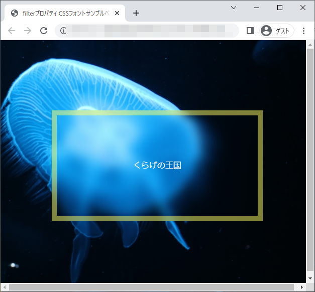
chromeブラウザ実行結果
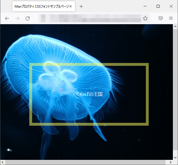
Firefox ブラウザ実行結果
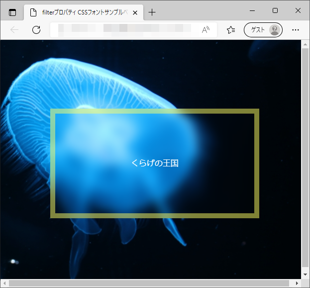
edgeブラウザ実行結果
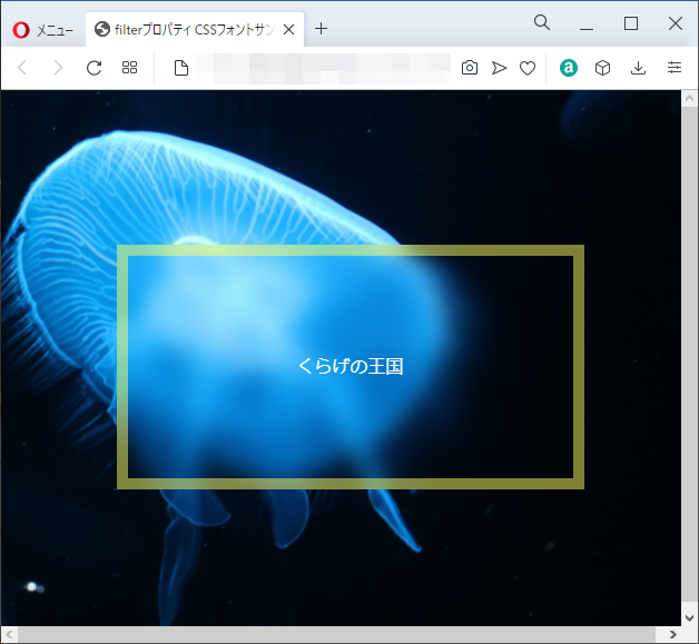
operaブラウザ実行結果

backdrop-filterプロパティ
| 初期値 | none |
| 適用される要素 | すべての要素。SVGではdefs要素とすべてのグラフィック要素を除くコンテナー要素 |
| モジュール | Filter Effects Module Level 2 |
| 継承 | なし |
概要・使用方法
{ backdrop-filter: 効果;}「backdrop-filterプロパティ」は、要素の背後の領域に適用するぼかしや色の変化などのグラフィック効果を指定します。要素の背後にすべて適用されるため、効果を確認するためには透明な要素かその背景を作成する必要があります。
指定できる表示サイズ
filterプロパティと同様
サンプルコード
<!DOCTYPE html>
<html lang="ja">
  <head>
    <title>backdrop-filterプロパティ CSSフォントサンプルページ</title>
    <meta charset="uft-8">
    <style>
           html,body{
                 height: 100%;
                 width: 100%;
           }
           body{
                 background-image: url("https://kcfran.com/sample/359600_s.jpg");
                 background-position: center center;
                 background-repeat: no-repeat;
                 background-size: cover;

           }
           .container {
                align-items: center;
                display: flex;
                justify-content: center;
                height: 100%;
                width: 100%;
            }

           .box{
                border:solid 10px rgba(255,255,100,0.5);
                align-items: center;
                display: flex;
                justify-content: center;
                backdrop-filter:blur(10px);
                color:#ffffff;
                height:200px;
                width:400px;
           }
    </style>
  </head>
  <body>
      <div class="container">
          <div class="box">
              <p>くらげの王国</p>
          </div>
      </div>
  </body>
</html>
chromeブラウザ実行結果
Firefox ブラウザ実行結果
edgeブラウザ実行結果
operaブラウザ実行結果
コメント