
円形のグラデーションを表示する「radial-gradient関数」、円形のグラデーションを繰り返して表示する「repeating-radial-gradient関数」の使用方法を記載
対応バージョン:CSS3/2.1
対応ブラウザ
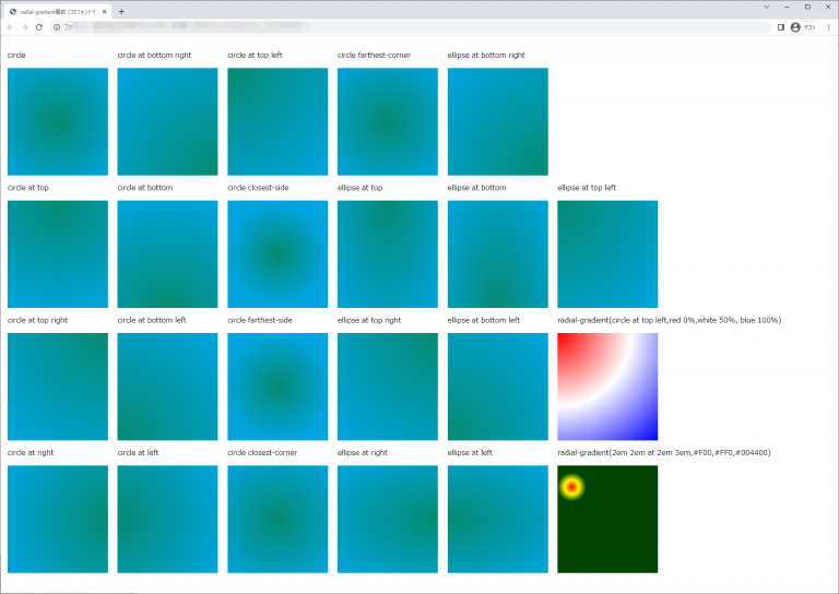
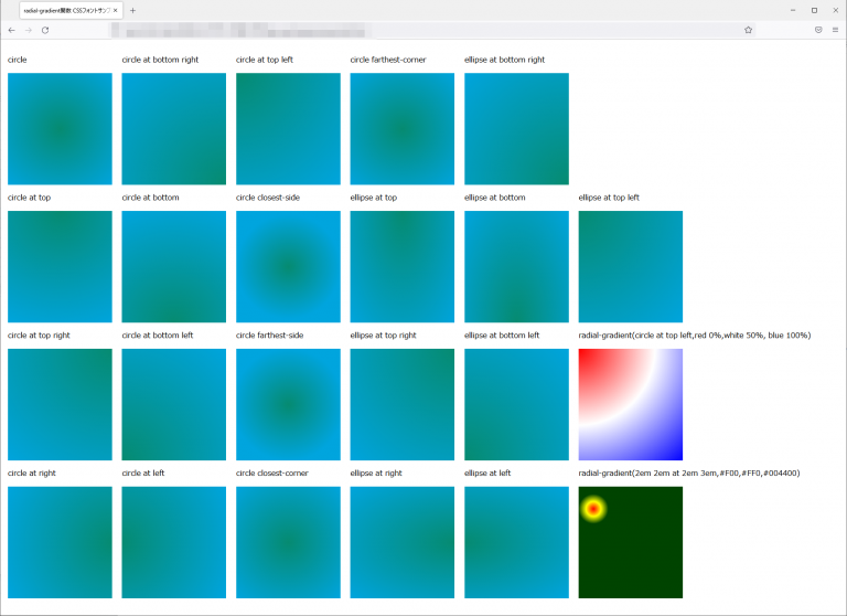
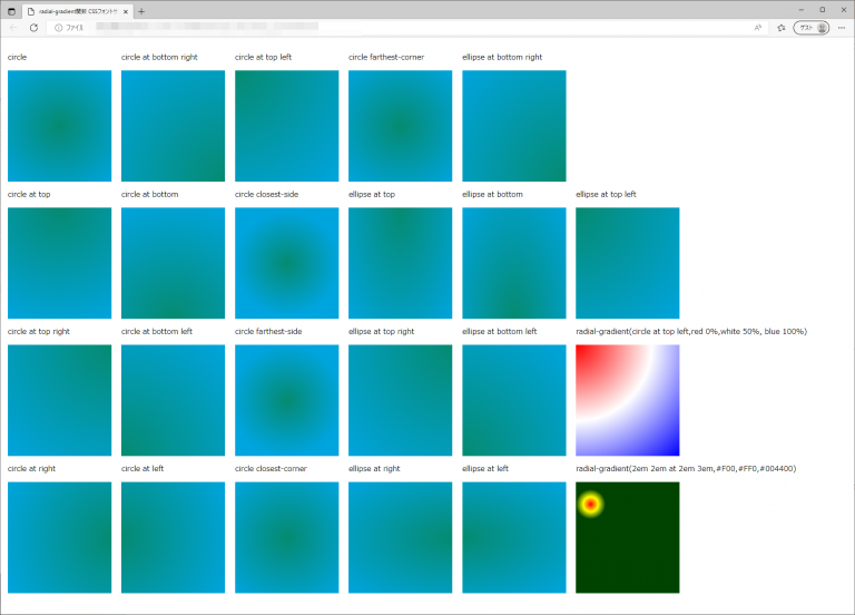
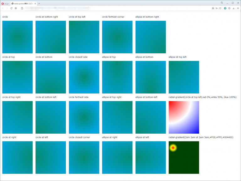
radial-gradient関数
| 使用できるプロパティ | 背景関連プロパティ |
| モジュール | image Values and Replaced Content Module Level 3 |
概要・使用方法
{ プロパティ:radial-gradient (形状 サイズ 中心の位置 , 始点色 始点位置 , 終点色 終点位置);}
{ プロパティ:radial-gradient (形状 サイズ 中心の位置 , 始点色 始点位置 , 途中色 途中位置 , 終点色 終点位置);}
CSS3で規定されているプロパティ値のうち、radial-gradient()では、色のグラデーションが円形もしくは楕円で放射状に広がる放射状グラデーションを指定できます。
開始位置は、グラデーションの円または楕円の中心点となる開始点を指定します。位置の指定方法は、background-positionプロパティと同様で、キーワード(top、right、bottom、left、center)、長さのサイズ値、パーセント値のいずれかの組み合わせで指定します。開始位置の省略時の既定値は「center」です。
形状は、グラデーションの形状を「circle」(円)または「ellipse」(楕円)で指定します。形状の指定を省略した場合の既定値は「ellipse」です。サイズは、グラデーションの大きさを、次の表のいずれかのキーワードで指定します。省略時の既定値は「farthest-corner」です。
形状とサイズの両方を指定する場合は、半角スペースで区切り、続けて記述します。開始位置、形状、サイズの指定後に、linear-gradient()と同様、グラデーションの開始色、中間色(省略可)、終了色をそれぞれカンマ(,)で区切って続けます。中間色は省略でき、また複数指定することも可能です。色の指定については、その色の配置点を、グラデーションの開始地点を0%、終了地点を100%としたときのパーセント値(または長さのサイズ値)を使って指定することができます。パーセント値(または長さのサイズ値)は、色の指定の後ろに半角スペースで区切って記述します。
引数の指定方法
形状
グラデーションの形状は以下の2つキーワードで指定します。
| circle | 正円のグラデーションを表します。 |
| ellipse(初期値) | 楕円のグラデーションを表します。 |
サイズ
グラデーションのサイズは以下のキーワードが指定できます。
| closest-side | 円の中心から領域のもっとも近い辺に内接するサイズになります。 |
| farthesl-side | 円の中心から領域のもっとも遠い辺に内接するサイズになります。 |
| closet-cornet | 円の中心から領域のもっとも近い頂点に内接するサイズになります。 |
| farthesl-cornet | 円の中心から領域のもっとも遠い頂点に内接するサイズになります。 |
| 数値と単位 | 水平・垂直方向の半径を半角スペースで区切って、単位付きの数値で指定します。 |
| % | 水平・垂直方向の半径を半角スペースで区切って、%値で指定します。値は親ボックスの幅と高さに対する割合となります。 |
中心の位置
グラデーションの中心位置を指定します。省略した場合は、「at center」が指定されます。
| at top | 領域の上辺が中心になります。 |
| at top right | 領域の右上角が中心になります。 |
| at right | 領域の右辺が中心になります。 |
| at bottom right | 領域の右下角が中心になります。 |
| at bottom | 領域の下辺が中心になります。 |
| at bottom left | 領域の左下角が中心になります。 |
| at left | 領域の左辺が中心になります。 |
| at top left | 領域の左上角が中心になります。 |
| at center | 領域の中央が中心になります。 |
| at 数値と単位 | 中心の座標を単位付きの数値で指定します。基準は領域の左上角です。 |
| at % | 中心の座標を%で指定します。値は領域の幅と高さの割合になります。 |
色
グラデーションの始点と終点の色を指定します。

始点、途中、終点の位置
グラデーションの始点と途中、終点の位置を指定します。角の色に続けて半角スペースで区切りで指定します。省略した場合は、始点は0%、終点は100%となります。
数値+単位の指定の詳細は以下を参照
サンプルコード
<!DOCTYPE html>
<html lang="ja">
  <head>
    <title>radial-gradient関数 CSSフォントサンプルページ</title>
    <meta charset="uft-8">
    <style>
           .disp{display:inline-block;margin:0.5em;}
           .circle{
               height:15em;
               width:14em;
               background: radial-gradient(circle,#068b71,#00a5de);
           }

           .ellipse{
               height:15em;
               width:14em;
               background: radial-gradient(ellipse,#068b71,#00a5de);
           }

           .circle-attop{
               height:15em;
               width:14em;
               background: radial-gradient(circle at top,#068b71,#00a5de);
           }

           .ellipse-attop{
               height:15em;
               width:14em;
               background: radial-gradient(ellipse at top,#068b71,#00a5de);
           }

           .circle-attopright{
               height:15em;
               width:14em;
               background: radial-gradient(circle at top right,#068b71,#00a5de);
           }

           .ellipse-attopright{
               height:15em;
               width:14em;
               background: radial-gradient(ellipse at top right,#068b71,#00a5de);
           }

           .circle-atright{
               height:15em;
               width:14em;
               background: radial-gradient(circle at right,#068b71,#00a5de);
           }

           .ellipse-atright{
               height:15em;
               width:14em;
               background: radial-gradient(ellipse at right,#068b71,#00a5de);
           }

           .circle-atbottomright{
               height:15em;
               width:14em;
               background: radial-gradient(circle at bottom right,#068b71,#00a5de);
           }

           .ellipse-atbottomright{
               height:15em;
               width:14em;
               background: radial-gradient(ellipse at bottom right,#068b71,#00a5de);
           }

           .circle-atbottom{
               height:15em;
               width:14em;
               background: radial-gradient(circle at bottom,#068b71,#00a5de);
           }

           .ellipse-atbottom{
               height:15em;
               width:14em;
               background: radial-gradient(ellipse at bottom,#068b71,#00a5de);
           }

           .circle-atbottomleft{
               height:15em;
               width:14em;
               background: radial-gradient(circle at bottom left,#068b71,#00a5de);
           }

           .ellipse-atbottomleft{
               height:15em;
               width:14em;
               background: radial-gradient(ellipse at bottom left,#068b71,#00a5de);
           }

           .circle-atleft{
               height:15em;
               width:14em;
               background: radial-gradient(circle at left,#068b71,#00a5de);
           }

           .ellipse-atleft{
               height:15em;
               width:14em;
               background: radial-gradient(ellipse at left,#068b71,#00a5de);
           }

           .circle-attopleft{
               height:15em;
               width:14em;
               background: radial-gradient(circle at top left,#068b71,#00a5de);
           }

           .ellipse-attopleft{
               height:15em;
               width:14em;
               background: radial-gradient(ellipse at top left,#068b71,#00a5de);
           }

           .circle-closest-side{
               height:15em;
               width:14em;
               background: radial-gradient(circle closest-side ,#068b71,#00a5de);
           }

           .circle-farthest-side{
               height:15em;
               width:14em;
               background: radial-gradient(circle farthest-side ,#068b71,#00a5de);
           }

           .circle-closest-corner{
               height:15em;
               width:14em;
               background: radial-gradient(circle closest-corner ,#068b71,#00a5de);
           }

           .circle-farthest-corner{
               height:15em;
               width:14em;
               background: radial-gradient(circle farthest-corner ,#068b71,#00a5de);
           }

           .type1{
               height:15em;
               width:14em;
               background-image: radial-gradient(circle at top left,red 0%,white 50%, blue 100%);
           }

           .type2{
               height:15em;
               width:14em;
               background-image: radial-gradient(2em 2em at 2em 3em,#F00,#FF0,#004400);
           }


    </style>
  </head>
  <body>
      <div class="disp">
          <p>circle</p>
          <div class="circle"></div>

          <p>circle at top</p>
          <div class="circle-attop"></div>

          <p>circle at top right</p>
          <div class="circle-attopright"></div>

          <p>circle at right</p>
          <div class="circle-atright"></div>
      </div>

      <div class="disp">
          <p>circle at bottom right</p>
          <div class="circle-atbottomright"></div>

          <p>circle at bottom</p>
          <div class="circle-atbottom"></div>

          <p>circle at bottom left</p>
          <div class="circle-atbottomleft"></div>

          <p>circle at left</p>
          <div class="circle-atleft"></div>
      </div>

      <div class="disp">
          <p>circle at top left</p>
          <div class="circle-attopleft"></div>

          <p>circle closest-side</p>
          <div class="circle-closest-side"></div>

          <p>circle farthest-side</p>
          <div class="circle-farthest-side"></div>

          <p>circle closest-corner</p>
          <div class="circle-closest-corner"></div>

      </div>

      <div class="disp">
          <p>circle farthest-corner</p>
          <div class="circle-farthest-corner"></div>

          <p>ellipse at top</p>
          <div class="ellipse-attop"></div>

          <p>ellipse at top right</p>
          <div class="ellipse-attopright"></div>

          <p>ellipse at right</p>
          <div class="ellipse-atright"></div>

      </div>

     <div class="disp">
          <p>ellipse at bottom right</p>
          <div class="ellipse-atbottomright"></div>

          <p>ellipse at bottom</p>
          <div class="ellipse-atbottom"></div>

          <p>ellipse at bottom left</p>
          <div class="ellipse-atbottomleft"></div>

          <p>ellipse at left</p>
          <div class="ellipse-atleft"></div>
      </div>

      <div class="disp">

          <p>ellipse at top left</p>
          <div class="ellipse-attopleft"></div>

          <p>radial-gradient(circle at top left,red 0%,white 50%, blue 100%)</p>
          <div class="type1"></div>

          <p>radial-gradient(2em 2em at 2em 3em,#F00,#FF0,#004400)</p>
          <div class="type2"></div>

      </div>

  </body>
</html>
circle
circle at top
circle at top right
circle at right
circle at bottom right
circle at bottom
circle at bottom left
circle at left
circle at top left
circle closest-side
circle farthest-side
circle closest-corner
circle farthest-corner
ellipse at top
ellipse at top right
ellipse at right
ellipse at bottom right
ellipse at bottom
ellipse at bottom left
ellipse at left
ellipse at top left
radial-gradient(circle at top left,red 0%,white 50%, blue 100%)
radial-gradient(2em 2em at 2em 3em,#F00,#FF0,#004400)
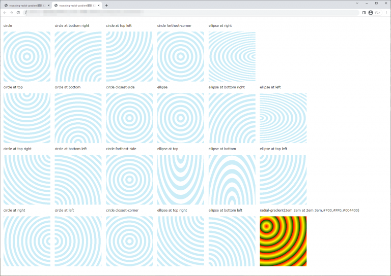
chromeブラウザ実行結果
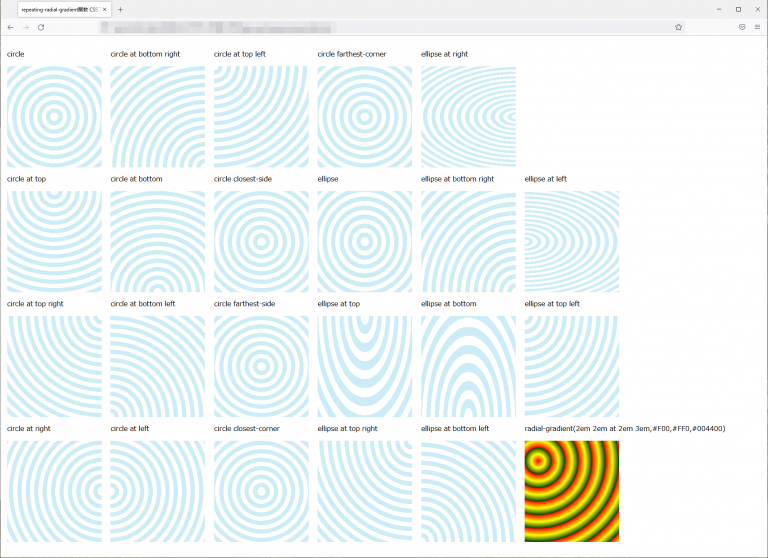
Firefox ブラウザ実行結果
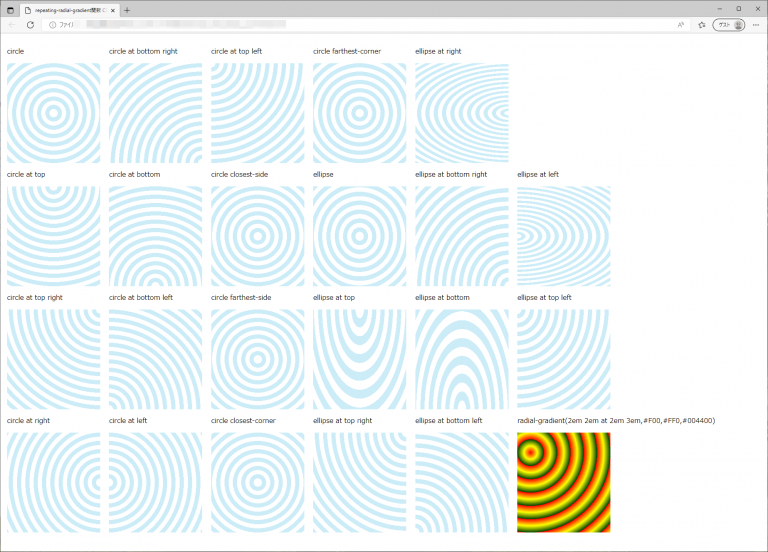
edgeブラウザ実行結果
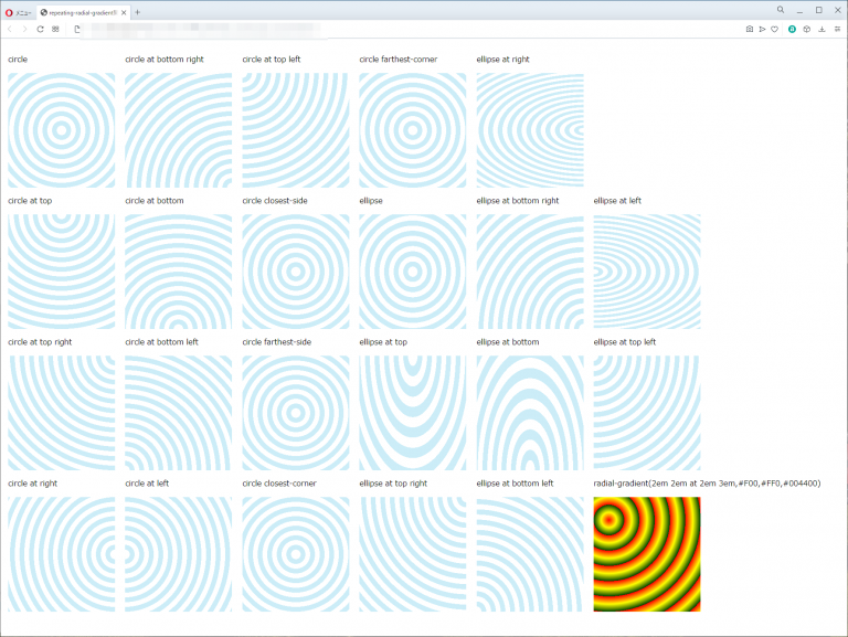
operaブラウザ実行結果
repeating-radial-gradient関数
| 使用できるプロパティ | 背景関連プロパティ |
| モジュール | image Values and Replaced Content Module Level 3 |
概要・使用方法
{ プロパティ:repeating-radial-gradient (方向,始点色 始点位置 , 終点色 終点位置);}
{ プロパティ:repeating-radial-gradient (方向,始点色 始点位置 , 途中色 途中位置 , 終点色 終点位置);}
CSS3で規定されているプロパティ値のうち、放射状グラデーションを繰り返すためのものです。記述方法はradial-gradient()と同じですが、繰り返しの位置(色の切り替え地点)を指定するために、中間色と終了色の配置点の記述が必要です。配置点は、グラデーションの開始地点を0%、終了地点を100%としたときのパーセント値、または開始地点からの長さのサイズ値を、色の指定の後ろに半角スペースで区切って記述します。負の値の指定も可能です。
サンプルコード
<!DOCTYPE html>
<html lang="ja">
  <head>
    <title>repeating-radial-gradient関数 CSSフォントサンプルページ</title>
    <meta charset="uft-8">
    <style>
           .disp{display:inline-block;margin:0.5em;}
           .repeating-circle{
               height:15em;
               width:14em;
               background: repeating-radial-gradient(circle,#fff 0px, #fff 10px, #ccedf8 10px, #ccedf8 20px );
           }

           .repeating-ellipse{
               height:15em;
               width:14em;
               background: repeating-radial-gradient(ellipse,#fff 0px, #fff 10px, #ccedf8 10px, #ccedf8 20px);
           }

           .repeating-circle-attop{
               height:15em;
               width:14em;
               background: repeating-radial-gradient(circle at top,#fff 0px, #fff 10px, #ccedf8 10px, #ccedf8 20px);
           }

           .repeating-ellipse-attop{
               height:15em;
               width:14em;
               background: repeating-radial-gradient(ellipse at top,#fff 0px, #fff 10px, #ccedf8 10px, #ccedf8 20px);
           }

           .repeating-circle-attopright{
               height:15em;
               width:14em;
               background: repeating-radial-gradient(circle at top right,#fff 0px, #fff 10px, #ccedf8 10px, #ccedf8 20px);
           }

           .repeating-ellipse-attopright{
               height:15em;
               width:14em;
               background: repeating-radial-gradient(ellipse at top right,#fff 0px, #fff 10px, #ccedf8 10px, #ccedf8 20px);
           }

           .repeating-circle-atright{
               height:15em;
               width:14em;
               background: repeating-radial-gradient(circle at right,#fff 0px, #fff 10px, #ccedf8 10px, #ccedf8 20px);
           }

           .repeating-ellipse-atright{
               height:15em;
               width:14em;
               background: repeating-radial-gradient(ellipse at right,#fff 0px, #fff 10px, #ccedf8 10px, #ccedf8 20px);
           }

           .repeating-circle-atbottomright{
               height:15em;
               width:14em;
               background: repeating-radial-gradient(circle at bottom right,#fff 0px, #fff 10px, #ccedf8 10px, #ccedf8 20px);
           }

           .repeating-ellipse-atbottomright{
               height:15em;
               width:14em;
               background: repeating-radial-gradient(ellipse at bottom right,#fff 0px, #fff 10px, #ccedf8 10px, #ccedf8 20px);
           }

           .repeating-circle-atbottom{
               height:15em;
               width:14em;
               background: repeating-radial-gradient(circle at bottom,#fff 0px, #fff 10px, #ccedf8 10px, #ccedf8 20px);
           }

           .repeating-ellipse-atbottom{
               height:15em;
               width:14em;
               background: repeating-radial-gradient(ellipse at bottom,#fff 0px, #fff 10px, #ccedf8 10px, #ccedf8 20px);
           }

           .repeating-circle-atbottomleft{
               height:15em;
               width:14em;
               background: repeating-radial-gradient(circle at bottom left,#fff 0px, #fff 10px, #ccedf8 10px, #ccedf8 20px);
           }

           .repeating-ellipse-atbottomleft{
               height:15em;
               width:14em;
               background: repeating-radial-gradient(ellipse at bottom left,#fff 0px, #fff 10px, #ccedf8 10px, #ccedf8 20px);
           }

           .repeating-circle-atleft{
               height:15em;
               width:14em;
               background: repeating-radial-gradient(circle at left,#fff 0px, #fff 10px, #ccedf8 10px, #ccedf8 20px);
           }

           .repeating-ellipse-atleft{
               height:15em;
               width:14em;
               background: repeating-radial-gradient(ellipse at left,#fff 0px, #fff 10px, #ccedf8 10px, #ccedf8 20px);
           }

           .repeating-circle-attopleft{
               height:15em;
               width:14em;
               background: repeating-radial-gradient(circle at top left,#fff 0px, #fff 10px, #ccedf8 10px, #ccedf8 20px);
           }

           .repeating-ellipse-attopleft{
               height:15em;
               width:14em;
               background: repeating-radial-gradient(ellipse at top left,#fff 0px, #fff 10px, #ccedf8 10px, #ccedf8 20px);
           }

           .repeating-circle-closest-side{
               height:15em;
               width:14em;
               background: repeating-radial-gradient(circle closest-side ,#fff 0px, #fff 10px, #ccedf8 10px, #ccedf8 20px);
           }

           .repeating-circle-farthest-side{
               height:15em;
               width:14em;
               background: repeating-radial-gradient(circle farthest-side ,#fff 0px, #fff 10px, #ccedf8 10px, #ccedf8 20px);
           }

           .repeating-circle-closest-corner{
               height:15em;
               width:14em;
               background: repeating-radial-gradient(circle closest-corner ,#fff 0px, #fff 10px, #ccedf8 10px, #ccedf8 20px);
           }

           .repeating-circle-farthest-corner{
               height:15em;
               width:14em;
               background: repeating-radial-gradient(circle farthest-corner ,#fff 0px, #fff 10px, #ccedf8 10px, #ccedf8 20px);
           }

           .repeating-type2{
               height:15em;
               width:14em;
               background-image: repeating-radial-gradient(2em 2em at 2em 3em,#F00,#FF0,#004400);
           }


    </style>
  </head>
  <body>
      <div class="disp">
          <p>circle</p>
          <div class="repeating-circle"></div>

          <p>circle at top</p>
          <div class="repeating-circle-attop"></div>

          <p>circle at top right</p>
          <div class="repeating-circle-attopright"></div>

          <p>circle at right</p>
          <div class="repeating-circle-atright"></div>
      </div>

      <div class="disp">
          <p>circle at bottom right</p>
          <div class="repeating-circle-atbottomright"></div>

          <p>circle at bottom</p>
          <div class="repeating-circle-atbottom"></div>

          <p>circle at bottom left</p>
          <div class="repeating-circle-atbottomleft"></div>

          <p>circle at left</p>
          <div class="repeating-circle-atleft"></div>
      </div>

      <div class="disp">
          <p>circle at top left</p>
          <div class="repeating-circle-attopleft"></div>

          <p>circle closest-side</p>
          <div class="repeating-circle-closest-side"></div>

          <p>circle farthest-side</p>
          <div class="repeating-circle-farthest-side"></div>

          <p>circle closest-corner</p>
          <div class="repeating-circle-closest-corner"></div>

      </div>

      <div class="disp">
          <p>circle farthest-corner</p>
          <div class="repeating-circle-farthest-corner"></div>

          <p>ellipse</p>
          <div class="repeating-ellipse"></div>

          <p>ellipse at top</p>
          <div class="repeating-ellipse-attop"></div>

          <p>ellipse at top right</p>
          <div class="repeating-ellipse-attopright"></div>

      </div>

     <div class="disp">
          <p>ellipse at right</p>
          <div class="repeating-ellipse-atright"></div>

          <p>ellipse at bottom right</p>
          <div class="repeating-ellipse-atbottomright"></div>

          <p>ellipse at bottom</p>
          <div class="repeating-ellipse-atbottom"></div>

          <p>ellipse at bottom left</p>
          <div class="repeating-ellipse-atbottomleft"></div>
      </div>

      <div class="disp">
           <p>ellipse at left</p>
          <div class="repeating-ellipse-atleft"></div>

          <p>ellipse at top left</p>
          <div class="repeating-ellipse-attopleft"></div>

          <p>radial-gradient(2em 2em at 2em 3em,#F00,#FF0,#004400)</p>
          <div class="repeating-type2"></div>

      </div>

  </body>
</html>
circle
circle at top
circle at top right
circle at right
circle at bottom right
circle at bottom
circle at bottom left
circle at left
circle at top left
circle closest-side
circle farthest-side
circle closest-corner
circle farthest-corner
ellipse
ellipse at top
ellipse at top right
ellipse at right
ellipse at bottom right
ellipse at bottom
ellipse at bottom left
ellipse at left
ellipse at top left
radial-gradient(2em 2em at 2em 3em,#F00,#FF0,#004400)
chromeブラウザ実行結果
Firefox ブラウザ実行結果
edgeブラウザ実行結果
operaブラウザ実行結果

コメント