
フレックスアイテムの配置方向と折り返しを一括して指定する「flex-flow」プロパティ、フレックスアイテムの設置方向を指定する「flex-direction」プロパティ、フレックスアイテムの折り返しを指定する「flex-wrap」プロパティの使用方法を記載
対応バージョン:CSS3/2.1
対応ブラウザ
flex-flowプロパティ
| 初期値 | 各プロパティに従う |
| 適用される要素 | 段組みされた要素 |
| モジュール | CSS Multi-column Layout Module |
| 継承 | なし |
概要・使用方法
{ flex-flow: -direction -wrap;}flex-flowプロパティは、フレックスアイテムの配置方向と折り返しを一括で指定することができます。
指定できる値は各プロパティと同様です。半角スペースで区切って指定できます。順序は順不同です。
フレキシブルボックスレイアウトの概念は「displayプロパティ」を参照

指定できる値
flex-directionプロパティとflex-wrapプロパティと同様です。
サンプルコード
<!DOCTYPE html>
<html lang="ja">
<head>
<title>flex-flowプロパティ CSSフォントサンプルページ</title>
<meta charset="uft-8">
<style>
.flex-flow-sample-flex1{
height:200px;
display: flex;
flex-flow:column wrap;
}
.flexbox-item1{
width:300px;
height:25px;
background-color:teal;
margin:10px;
padding:25px;
text-align:center;
}
.flexbox-item2{
width:300px;
height:25px;
background-color:silver;
margin:10px;
padding:25px;
text-align:center;
}
</style>
</head>
<body>
<h1> nowrap</h1>
<div class="flex-flow-sample-flex1">
<div class="flexbox-item1">フレックスボックスアイテム1</div>
<div class="flexbox-item2">フレックスボックスアイテム2</div>
<div class="flexbox-item1">フレックスボックスアイテム3</div>
<div class="flexbox-item2">フレックスボックスアイテム4</div>
</div>
</body>
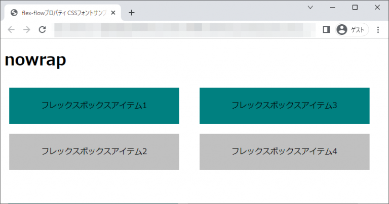
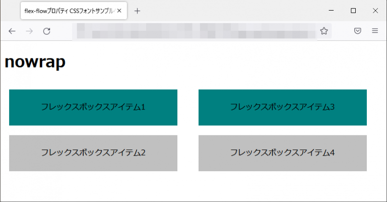
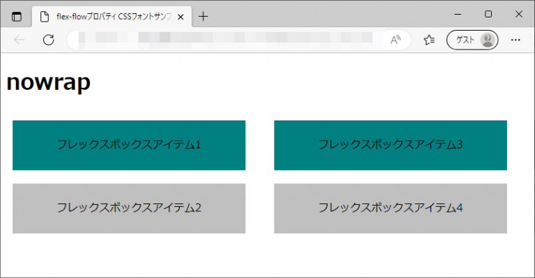
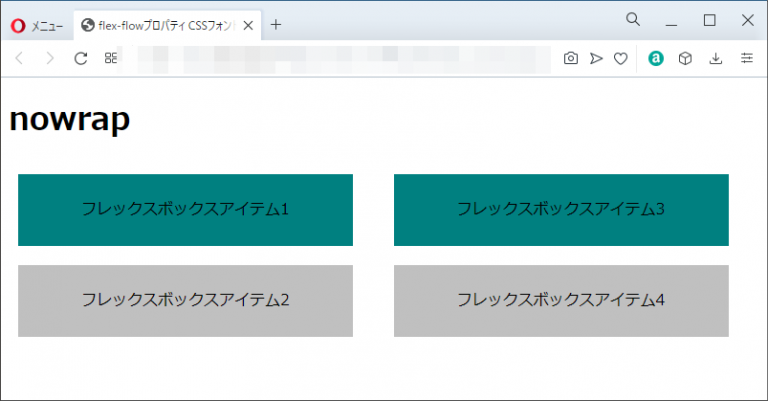
</html>nowrap
フレックスボックスアイテム1
フレックスボックスアイテム2
フレックスボックスアイテム3
フレックスボックスアイテム4
chromeブラウザ実行結果
Firefox ブラウザ実行結果
edgeブラウザ実行結果
operaブラウザ実行結果
flex-directionプロパティ
| 初期値 | row |
| 適用される要素 | フレックスコンテナ |
| モジュール | CSS Flexible Box Layout Module Level1 |
| 継承 | なし |
概要・使用方法
{ flex-direction: 方向;}flex-directionプロパティは、フレックスコンテナのメイン軸の方向を指定することで、フレックスアイテムの配置方向を指定します。
指定できる値
指定できる値は各プロパティと同様です。半角スペースで区切って指定できます。順序は順不同です。
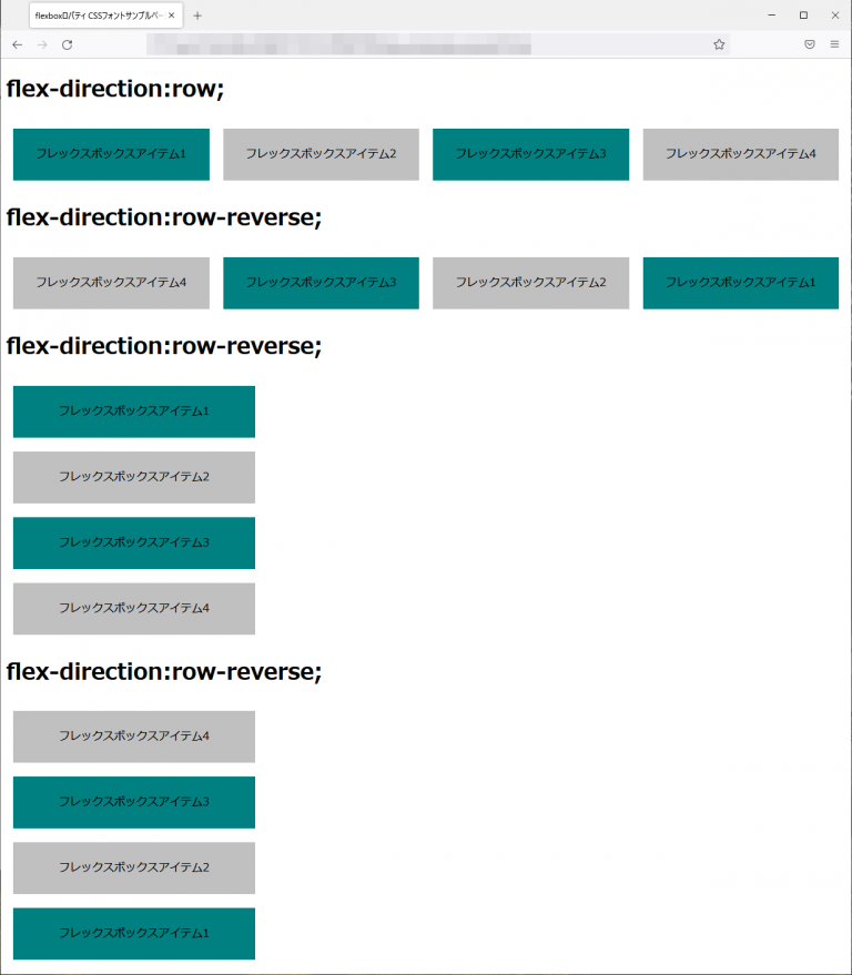
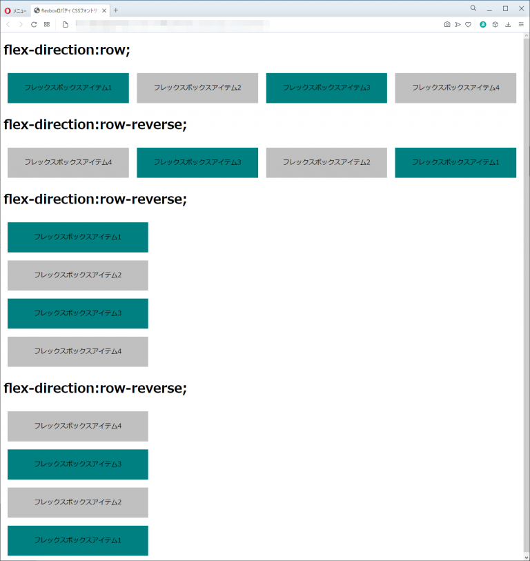
| row(初期値) | メイン軸の方向に、フレックスボックスアイテムを左から右に配置されます。 |
| row-reverse | メイン軸の方向に、フレックスボックスアイテムは右から左へ配置されます。 |
| column | クロス軸の方向に、フレックスボックスアイテムを上から下に指定する。 |
| column-reverse | クロス軸の方向に、フレックスボックスアイテムを下から上に指定する。 |
サンプルコード
<!DOCTYPE html>
<html lang="ja">
  <head>
    <title>flex-directionプロパティ CSSフォントサンプルページ</title>
    <meta charset="uft-8">
    <style>
    .sample-flex1{
      display: flex;
      flex-direction:row;
    }
    .sample-flex2{
      display: flex;
      flex-direction:row-reverse;
    }
    .sample-flex3{
      display: flex;
      flex-direction:column;
    }
    .sample-flex4{
      display: flex;
      flex-direction:column-reverse;
    }
    .flexbox-item1{
      width:300px;
      height:25px;
      background-color:teal;
      margin:10px;
      padding:25px;
      text-align:center;
    }
    .flexbox-item2{
      width:300px;
      height:25px;
      background-color:silver;
      margin:10px;
      padding:25px;
      text-align:center;
    }
    </style>
  </head>
  <body>
      <h1> flex-direction:row;</h1>
      <div class="sample-flex1">
        <div class="flexbox-item1">フレックスボックスアイテム1</div>
        <div class="flexbox-item2">フレックスボックスアイテム2</div>
        <div class="flexbox-item1">フレックスボックスアイテム3</div>
        <div class="flexbox-item2">フレックスボックスアイテム4</div>
      </div>
      <h1> flex-direction:row-reverse;</h1>
      <div class="sample-flex2">
        <div class="flexbox-item1">フレックスボックスアイテム1</div>
        <div class="flexbox-item2">フレックスボックスアイテム2</div>
        <div class="flexbox-item1">フレックスボックスアイテム3</div>
        <div class="flexbox-item2">フレックスボックスアイテム4</div>
      </div>
      <h1> flex-direction:row-reverse;</h1>
      <div class="sample-flex3">
        <div class="flexbox-item1">フレックスボックスアイテム1</div>
        <div class="flexbox-item2">フレックスボックスアイテム2</div>
        <div class="flexbox-item1">フレックスボックスアイテム3</div>
        <div class="flexbox-item2">フレックスボックスアイテム4</div>
      </div>
      <h1> flex-direction:row-reverse;</h1>
      <div class="sample-flex4">
        <div class="flexbox-item1">フレックスボックスアイテム1</div>
        <div class="flexbox-item2">フレックスボックスアイテム2</div>
        <div class="flexbox-item1">フレックスボックスアイテム3</div>
        <div class="flexbox-item2">フレックスボックスアイテム4</div>
      </div>
  </body>
</html>
flex-direction:row;
フレックスボックスアイテム1
フレックスボックスアイテム2
フレックスボックスアイテム3
フレックスボックスアイテム4
flex-direction:row-reverse;
フレックスボックスアイテム1
フレックスボックスアイテム2
フレックスボックスアイテム3
フレックスボックスアイテム4
flex-direction:row-reverse;
フレックスボックスアイテム1
フレックスボックスアイテム2
フレックスボックスアイテム3
フレックスボックスアイテム4
flex-direction:row-reverse;
フレックスボックスアイテム1
フレックスボックスアイテム2
フレックスボックスアイテム3
フレックスボックスアイテム4
chromeブラウザ実行結果

Firefox ブラウザ実行結果
edgeブラウザ実行結果
operaブラウザ実行結果
flex-wrapプロパティ
| 初期値 | nowrap |
| 適用される要素 | フレックスコンテナ |
| モジュール | CSS Flexible Box Layout Module Level1 |
| 継承 | なし |
概要・使用方法
{ flex-wrap: 折り返し;}flex-wrapプロパティは、フレックスアイテムの折り返しを指定します。また、折り返す場合の方向も指定できます。
指定できる値
指定できる値は各プロパティと同様です。半角スペースで区切って指定できます。順序は順不同です。
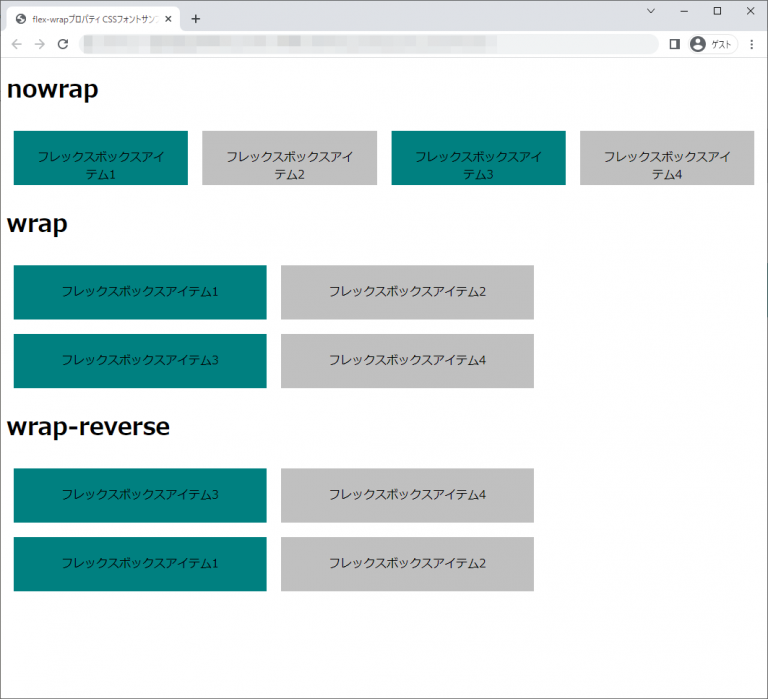
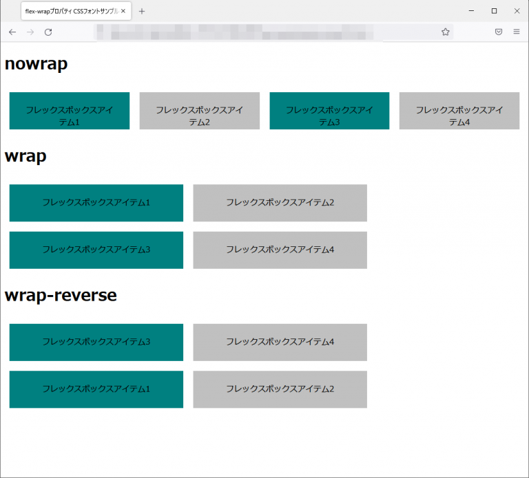
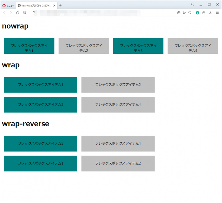
| nowrap | フレックスアイテムは折り返されず、1行で表示されます。 |
| wrap | フレックスアイテムは折り返され、複数行で表示されます。通常は上から下に折り返され2行目以降のアイテムは左から右に配置されます。 |
| wap-reverse | フレックスアイテムは折り返され、複数行で表示されます。ただし、wrapとは逆に、下から上に折り返されます。 |
サンプルコード
<!DOCTYPE html>
<html lang="ja">
  <head>
    <title>flex-wrapプロパティ CSSフォントサンプルページ</title>
    <meta charset="uft-8">
    <style>
    .wrap-sample-flex1{
      display: flex;
      flex-direction:row;
      flex-wrap:nowrap;
    }
    .wrap-sample-flex2{
      display: flex;
      flex-direction:row;
      flex-wrap:wrap;
    }
    .wrap-sample-flex3{
      display: flex;
      flex-direction:row;
      flex-wrap:wrap-reverse;
    }
    .flexbox-item1{
      width:300px;
      height:25px;
      background-color:teal;
      margin:10px;
      padding:25px;
      text-align:center;
    }
    .flexbox-item2{
      width:300px;
      height:25px;
      background-color:silver;
      margin:10px;
      padding:25px;
      text-align:center;
    }
    </style>
  </head>
  <body>
      <h1> nowrap</h1>
      <div class="wrap-sample-flex1">
        <div class="flexbox-item1">フレックスボックスアイテム1</div>
        <div class="flexbox-item2">フレックスボックスアイテム2</div>
        <div class="flexbox-item1">フレックスボックスアイテム3</div>
        <div class="flexbox-item2">フレックスボックスアイテム4</div>
      </div>
      <h1>wrap</h1>
      <div class="wrap-sample-flex2">
        <div class="flexbox-item1">フレックスボックスアイテム1</div>
        <div class="flexbox-item2">フレックスボックスアイテム2</div>
        <div class="flexbox-item1">フレックスボックスアイテム3</div>
        <div class="flexbox-item2">フレックスボックスアイテム4</div>
      </div>
      <h1>wrap-reverse</h1>
      <div class="wrap-sample-flex3">
        <div class="flexbox-item1">フレックスボックスアイテム1</div>
        <div class="flexbox-item2">フレックスボックスアイテム2</div>
        <div class="flexbox-item1">フレックスボックスアイテム3</div>
        <div class="flexbox-item2">フレックスボックスアイテム4</div>
      </div>
  </body>
</html>
nowrap
フレックスボックスアイテム1
フレックスボックスアイテム2
フレックスボックスアイテム3
フレックスボックスアイテム4
wrap
フレックスボックスアイテム1
フレックスボックスアイテム2
フレックスボックスアイテム3
フレックスボックスアイテム4
wrap-reverse
フレックスボックスアイテム1
フレックスボックスアイテム2
フレックスボックスアイテム3
フレックスボックスアイテム4
chromeブラウザ実行結果
Firefox ブラウザ実行結果
edgeブラウザ実行結果

operaブラウザ実行結果

コメント